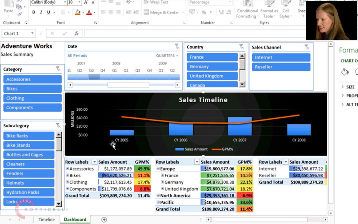
Let Carmel Gunn show you how to build a fully fledged, good-looking enterprise dashboard in Excel—in under 30 minutes. Log-in or get a free account to watch her show you Excel as an enterprise-grade BI client, in the way she uses it for her clients at Prodata SQL Centre of Excellence in Dublin, a company specialising in enterprise business intelligence.
First, you need to connect to an enterprise BI data source, such as a multidimensional cube, or a tabular model. Once a connection has been made, you are ready to create a dashboard in Excel 2013+ and to visualise data in an attractive way, for example by using recommended chart types. Conditional formatting of dashboard tables enables quick visual interpretation of business data in a way that draws attention to what one needs to know. There are a few shortcuts, like cutting and pasting pivot tables to create a new report part, that can speed up the creation of different reports from the same data source, by bypassing the requirement to connect the new report part to the source.
A powerful feature of Excel are user-defined MDX calculated measures. They let you add finer levels of business value to a dashboard, by allowing you to create your own bespoke calculations. This way, you can enhance the functionality of the underlying data model. After you have added slicers and timelines to a dashboard, they need to be linked to all the data elements on the report via report connections, to enable them to filter different report parts simultaneously, and to filter multiple items at the same time. This is a very important feature for building anything but trivial dashboards.
Overlaying multiple data sets on the same chart is a frequent reporting request. When carefully planned, adding a secondary chart axis lets you show different units, or scales, on the same chart, while still keeping the chart meaningful. Be careful, however, of mixing different units of measurement, as this technique might sometimes mislead the viewer, if, for example, different lines cross each other, yet the crossing points only depend on the choice of a scale, rather than on the data itself.
As the dashboard is nearing completion, Carmel shows you how it can be used for interactive data exploration. While exploring, you may want to further adjust the formatting, including making improvements to any secondary axes.
When you have created a dashboard, you now have your own, personal BI! In order to share it with others, and to promote it to the status of team BI, or perhaps to company-wide enterprise BI, you simply need to save it to SharePoint. Carmel shows you how easy it is with SharePoint Server. As soon as the dashboard appears in the report gallery, your team is ready to use it. Don’t miss the new Quick Explore feature of Excel which allows you to drill data using different dimensions to what the dashboard initially shows. This important, new functionality works the same way in Excel and through the browser, also referred to as the thin client, thanks to SharePoint.
One of the most demanded BI features in any company is making reports and dashboards look good on mobile devices, such as iPads, iPhones, Android and Surface. Again, all you need is the combination of Excel and SharePoint—Carmel shows how to be selective as to which parts of our newly created dashboard should be made available on mobile devices, and then she shows you how to save them, making them instantly mobile, whilst still maintaining the ability to interact with, and modify the dashboard.
If you would like to follow Carmel’s steps on your own, you will need to connect to a suitable BI data model. As this course is aimed at the end-user, you may want to ask your IT department to give you access to such a cube, like the well-know sample cube of Adventure Works. You can also use a Power Pivot with an Adventure Works tabular model for your learning, if you have additional IT skills and access to SQL Server Analysis Services, consider loading the same data set as used by Carmel—you can download the Adventure Works cube from GitHub.
All of the concepts presented in this video are simple to implement, and should help you build dashboards for yourself and for your organisation.


